Why do phones and calculators have different numpads?

keypadwars-01

Take into account all the places that utilize the number pad and you’ll notice a disparity that’s quite odd but humanity seems to have made peace with.

The number pad. You see it everywhere, from your dialer, to your calculator, to your PIN bypass on the phone unlock screen. You’ll see it on the right of your keyboard on your computer (if you’ve got a numpad), and you’ll see it in your ATM machines, cash registers, card readers, security systems, and if you’ve still got one, your landline phone. The numbers, for obvious reasons, are the same… but the layouts aren’t. Phone dialers and ATM machines have it starting at the top with 1, going down to 9 and ending with a 0 at the base, sitting between the asterisk and the hashtag; but you look at the calculator, the cash register, or the computer’s number pad and it’s the other way around. The zero or the lowest value sits at the bottom and it increments moving upwards, ending with nine right at the top. It’s always bewildered me that we’ve had these two separate systems for separate machines, even today. There’s no fixed reason for the difference in layout, but there seem to be a few interesting theories to define exactly how we arrived at this bizarre predicament.

My favorite theory takes us on a time-traveling trip. The reason the two keypads have different layouts today is because they were two completely different products, using different technologies, for different purposes. Long before the modern day touch-tone phone, we were used to the rotary phone, which arranged the numbers from 1 to 0 on a circular dial that you’d rotate (the zero was actually treated as a 10. I explain why a little later*). With the advent of touch-tone hardware in the 50s, companies decided to stick roughly to the current layout, having the 1 at the starting, and the 9 and 0 (or ten, as they called it) at the end. They followed the calculator’s 3×3 matrix for the 1 to 9 (arranged from left to right), putting the 0 at the bottom, between the * and #.

The calculator, on the other hand, had been designed long before the modern phone, and used a format with 789 at the top. The design of the calculator was based on that of the cash register. The keypad’s layout wasn’t an evolutionary one like the telephone, but a functional one. The 0 was placed intentionally at the bottom of cash registers because with the currencies that were used, the 0 was pressed much more often than any key, so it made sense to keep it within hands reach. Having currencies with the denominations 1, 2, 5, 10, 20, 50, 100 etc, it also made more sense to keep these lower numbers towards the base too. So the 1 and 2 were placed immediately above the 0, making the cash register easier to operate. The calculator simply followed this functional format.

telephone_calculator

A rotary telephone and a calculator (or an adding-machine)

*In the days of rotary dials the pulse signaling system was known as ‘loop-disconnect’. Each digit dialed produced a series of quick disconnections in the ‘loop’ just milliseconds long. Dialing a 1 creating one disconnection, dialing 2 created two disconnections in the loop. The telephone exchange (or the central office) could detect these disconnections and step the electro-magnetic mechanical switches that then connected you to the number you dialed. Dialing a 0 would create 10 disconnections in the loop, so what looked like a 0 was actually a 10, if you count the number of disconnections in the loop.

The second theory also seems interesting because it talks about creating two separate counter-intuitive, reversed layouts on purpose. The calculator was invented long before the touch-tone telephone and was used for data-entry. Data-entry professionals using these calculators had gotten into the habit of crunching numbers at incredible speeds. The touch-tone phone, however, couldn’t operate at those speeds and oftentimes would end up missing a number or two. Phone companies then decided to reverse the layout to “confuse” people, allowing them to take more time to dial the number correctly, giving the telephone enough time to register the number dialed. Marvelous, isn’t it?! It’s a shame that none of these theories can be claimed as the one-true reason we have different keypads.

It’s worth also noticing how in the phone, the 0 falls after the 9 since it’s actually considered to be a 10, and how on the calculator the 0 falls before the 1 because it’s treated as a 0 or a number with no value. In both their formats, the 0 finds itself at its appropriate place, according to the value assigned to it! I still find it silly that we’ve held onto this strange past all these years, but the history lesson (and its share of speculative theories) that comes with it definitely makes me look at this strange duality with awe!

from Yanko Design https://ift.tt/2pAvO1d
via IFTTT

Why the right mindset is crucial to becoming a successful Business Designer


How to become a Business Designer (1/3) — the mindset

Business Design is the most important skill of the future. We need its unique approach to create sustainable business models in a world of fast changes. Business Design helps us to understand the context of our businesses, develop new business models and test them quickly.
But what do Business Designers actually do — and how can you become one?

This article is for you if:

  • you are a recent graduate or professional who thinks about a career change,
  • you are a hiring manager looking to fill a position related to Business Design, or
  • you are an executive manager, who wants to understand what impact Business Design can have in her organization.

During my time at Service Innovation Labs I have hired and mentored many different Business Designers and interviewed even more. As a consequence I gained a clear picture of what it takes to be an extraordinary Business Designer.

The multi-layered structure of successful Business Design

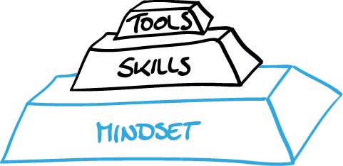
The requirements for a successful Business Designer have three levels: mindset, skills and tools.

Fig. 1 — The mindset forms the basis for a successful Business Designer. On that rest the skills he acquired and the tools he uses.

The mindset defines how a person approaches a task at hand. You can assess the mindset with questions like: How do you think? How do you approach a problem? Which mental models do you apply?

Building on that, certain skills are needed to successfully complete the tasks that a Business Designer has to perform. This includes innovation strategy, business model design, storytelling and more. It answers questions like: What do you know? What theories are you accustomed with? Which books do you read?

Complementary to that are tools. They are what Business Designers use every day to put their skills and mindset into action. Examples are the business model canvas, pricing strategies, and marketing funnels. To find out about these you ask a Business Designer: How do you work? What are the methods you use? What are the most important tools or frameworks for your work?

My series starts with a description of the mindset of a Business Designer. I will elaborate on skills and tools in article two and three of this series— for updates, follow me on medium or join my mailing list.

How do you think? The mindset of a Business Designer

The mindset makes the difference between a great Business Designer and an average one, as the latter only uses the Business Design tools without a deeper understanding. However, this mindset is hard to learn quickly, instead it is usually learned from a range of past experiences.

Next, I list the concepts that are second nature to excellent Business Designers.

Design approach

For Business Designers it is not enough to be analytical thinkers —they also need to be creative.
Business Designers at our company usually come from a quantitative background (e.g. business, mathematics, or psychology). They are very strong in analyzing problems and excel at convergent thinking, helping them making choices and reducing the number of possible solutions.

Fig. 2 — The double diamond shows the four phases of the design process that you apply to get from a first question and problem to the prototype of a solution. In the process diverging and converging thinking alternate.

In addition to that, though, Business Designers need to adopt the explorative and creative mind-set of a designer. They need to apply divergent thinking to create new, innovative, and even unintuitive solutions. As I have a quantitative background, learning this mindset has been the most difficult part of Business Design because it is furthest from the way I usually approach problems. For a designer it is the other way around: they are used to think divergingly and create a lot of different options.

Business schools do very well at training their graduates to identify problems and solve them analytically. In contrast, in the early phases of a design project you have to widen the scope and explore the problem space without knowing where you will end up. A Business Designer needs to adopt and balance both approaches: applying analytical thinking while embracing and welcoming the uncertainty.

Fig. 3 — The innovation process moves from the concrete and analytical research to the more abstract synthesis. The findings are used to generate a concept that is used to create a concrete prototype that can be tested.

Try it

If you also have an analytical background, it will take practice in creative projects and trying out different approaches to learn this mindset. You might give it a try at your next assignment by not approaching it directly, but take a step back and take time to figure out the underlying problem. Then come up with wild ideas how to solve that problem and narrow your solutions down only from there.

Reading

Service Design by Andy Polaine gives a good overview over the field and its concepts.

Lean Startup

A Business Designer tests her assumptions as early as possible and learns from the insights.
One of the core methodologies of Business Designers is the concept that Eric Ries popularized as Lean Startup (it shares ideas with the PDCA method). A Business Designer follows the iterative build-measure-learn cycle. She identifies assumptions about the innovation and formulates hypotheses. Subsequently, she prioritizes them to identify the most critical assumptions and tests them in the market and with potential customers. She makes sure to build prototypes and gets feedback early. She draws insights from the customer reactions and they feed into the next cycle of the next prototype.

Fig. 4 — The build-measure-learn cycle is based on hypotheses that are tested. The insights feed into a new cycle.

Try it

Before starting your next project, think about how to test the underlying assumptions and build a quick prototype to evaluate them. Get feedback on your ideas from real customers within a day.

Reading

With Running Lean, Ash Maurya iterated both on the Lean Startup and the Business Model Canvas and created the lean canvas that has a strong focus on finding the right problem to solve first.

User focus

An innovation must provide real customer value to be relevant in the market.
To think about a business model is to think about how to create, deliver and capture value. To create value, a good Business Designer needs to understand the users just as well as the systems around them. He must find out about the customer needs as much as he can. He knows about the power of customer research and builds empathy with the user to design a compelling and focused value proposition. He works together with user researchers to test hypotheses that are relevant to the business model.

Fig. 5 — The Kano model assesses features according to customer value: hygiene factors have to be fulfilled but do not excite customers. Performance factors increase satisfaction linearly with increasing quality or number. A Business Designer includes a delighter: it inspires the customer and creates loyality with reasonable effort.

Try it

Include the customer perspective in your next project. Leave the office to talk to people, pick up the phone, or shadow your sales personnel. Make sure you understand the needs of the user and make it a high priority to fulfill them.

Reading

The User Experience Team of One helps you to be just that. In addition, Interviewing Users is a deep dive into user interviews.

Entrepreneurship

A Business Designer gets things done.
She is pragmatic and finishes the task at hand. She tends towards doing and testing instead of over-analyzing. She rather starts a quick test and iterates on the results. She always has the business impact in mind and believes in the good old pareto-principle (20% of the effort produces 80% of the outcome). She is hands-on and wins every marshmellow challenge. She knows how to handle productivity frameworks and values good ideas over politics. She thinks out of the box and finds solutions in unexpected places.

Fig. 6– According to the pareto principle in many situations 20% of the effort result in 80% of the effect. Any additional effort is suspicious of perfectionism.

Try it

For a day, give yourself half of the time that you planned to take for each task and jump to the next thing on your priority list instead. Look back after a day and evaluate the impact that you made.

“Nobody wants to steal your perfect idea. It is 1% idea and 99% execution.” — a #startupcookie

Reading

Getting things done by David Allen is a classic on productivity that takes its strength from separating the planning and execution of tasks.

Curiosity

A Business Designer stays up to date on trends and changes.
Innovation often is a result of a clever recombination of existing ideas. Therefore, a Business Designer needs a broad understanding of different industries and business models. He scans the market and follows current trends. He is very good at asking questions and at listening. He is open to new experiences and makes connections to previous knowledge. He constantly tries to make sense of the world around him.

Fig. 7 —According to Innovator’s Dilemma an incumbent serves a customer need increasingly well (1) until it starts to over-shoot customer needs (2). Innovators focus on actual customer wishes and serve them better at a lower price, e.g. by un-bundling offers (3). Eventually the innovator fulfills all customer needs at the expense of the incumbent: he got disrupted (4). A Business Designer knows this dynamic and takes timely precautions.

Try it

Look up relevant topics for your project or industry on meetup.com and join a group of like-minded people in your area. You will get a quick deep dive into a topic and a fresh perspective.

“Stay hungry, stay foolish.” — Steve Jobs

Reading

In the classic Innovator’s Dilemma Clayton Christensen describes the process of incumbents being disrupted by new market entrants.

Collaboration

Business Designers are team players.
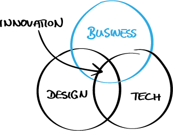
Innovation happens at the intersection of business, design and technology. In order to bring great ideas forward, Business Designers work together with service designers, software developers and other professionals. They understand the strengths of a broad range of disciplines and know how to collaborate with them.
In addition to that, Business Designers know how to manage stakeholders. They understand their motivation and goals and know how to align them.

Fig. 8 — Innovation still happens at the intersection of business (viability), design (desirability) and tech (feasability).

Try it

Apply your user-centric mindset to your stakeholders and interview or shadow them to find out about their aims.

Reading

For an introduction to the feasibilty part read on product management in Build Better Products.

How do you achieve a Business Design mindset?

We have learned six different concepts that form the Business Design mindset. The best way to master them is to get firsthand experience in an environment that values this mindset. You will find it for example in digital consultancies, design agencies and startups.

If you cannot apply them right away, start to learn from books and online publications, meet fellow Business Designers at meetups and conferences or join the Business Design LinkedIn group.

Use this to start as an intrapreneur in your own organisation: Whether you are an entry-level analyst that wants to try out a different approach, or you are an executive manager who wants to change the working of your organisation to adapt to digital challenges, start with some of the concepts and create tangible results. If you are successful, people will approach you and ask how you made this happen. Starting from there you can introduce more and more of these concepts.

Conclusion

The Business Design mindset includes designer approach, Lean Startup, user focus, entrepreneurship, curiosity, and collaboration. 
A Business Designer uses these concepts to understand threats to an existing business, to spot new opportunities and to come up with novel ideas. At the same time, he is able to implement new concepts and test and iterate them to generate customer value. Thereby he creates sustainable business models.

Now it is your turn. Join our discussion and answer in the comment section:

What was the biggest challenge that you solved with a Business Design mindset?

For more book inspirations check my list of Business Design books. For updates on my next article on Business Desing skills follow me on medium, twitter, or linkedin, or subscribe to my mailing list.


from Muzli -Design Inspiration – Medium https://ift.tt/2G9ATsA
via IFTTT
Product design is not only about mockups and prototypes

Some modest advice to product designers

Design principles, design tools, sketches, mockups, prototypes. I am not going to talk about any of the above in this particular piece. My goal is to give you a brief idea of what I’m thinking as the “extra mile” when talking for product designers.

The design process my team is currently following

Let’s set the context. I’m primarily speaking for product design in software products, as this is my area of expertise and primary experience in working with designers. The process that my teams are currently following when it comes to product design is pretty typical. A brief description:

  1. Content: It follows the market and user research and it’s the stage where the product team is putting down every little detail related with the product requirements.
  2. Wireframes: Once the content is there, the designers start creating the first sketches and wireframes of the product.
  3. Mockups: After a few iterations of the wireframes, we’re creating pixel perfect prototypes (that are going under a new set of iterations) and the final mockups are provided to the developers, so that they can build the product.
  4. Iterations: Once the product is shipped, based on user feedback and analytics, the product is iterated so that we can hit our goals, improve user experience and drive further adoption.

Walking the extra mile

I guess that a design process like the one described above is not much of a surprise. So, let’s jump to the essence of this article. Obviously, the following, are not core skills that a designer should possess, but in my perspective, those are the skills that could give a designer a slight advantage, so that he or she could take their product designs to the next level.

1. Understand the market

Some basic knowledge regarding the industry where the product operates is beneficial. Obviously, this knowledge can be acquired after some time working in a company from the team itself. But a few readings regarding the market, its main long-lasting problems, how the top competitors are dealing with them can give you a huge advantage and save you a lot of time from going back and opening Sketch once again.

2. Have some F2F experience with the user

Yes, the PM is the one responsible for bringing in the insights from the market and the clients, alongside the requirements for the product. However, spending some time, even as a silent listeners in a few calls with clients can give you a much better understanding and perspective about their needs and pains. The data are the driver, but the direct feedback from the users and especially observing their emotions when talking about their pains are the noise in the back seat. If you can listen to that noise carefully, you’ll see that there’s a lot to learn there. Try joining a colleague of yours in a call with a client related with their needs once in a while. You may be surprised.

3. Seek to learn more about the product

I am not talking about the high level stuff. Some quality time with engineers and the challenges they are facing every now and then could be quite lucrative. You may find out that many of those challenges are directly related with your own designs. Maybe this is an opportunity to make their life easier the next time, or maybe avoid making your life more complex.

4. Be consistent but dare to do ground braking changes

Obviously, when working on a specific product your designs have to be consistent. It’s a matter of keeping a smooth user experience, a small learning curve when introducing new features and a matter of branding as well. Not to mention, that in many industries is very hard to avoid designing according to a certain norm. This obstacle will always be there, but the users always need something fresh. Most of the times, they are what I like to call “change averse”, meaning that when you ask them to do something in a completely different manner than the one they are used to, they are reluctant from the very first moment. To my experience though, if what you’re suggesting is reasonable, soon enough they will see for themselves and jump into your cool new way of doing things. I acknowledge that it’s hard to make it work in most of the cases, however if you don’t try things and most importantly fail, you will never be in position to suggest something innovative to your users.

The above advices could not only stand for product designers, but also for anyone working on a product. One of the methods that I’ve introduced to encourage the approach described above is that there’s an “open door” policy for all the meetings or discussions, even if they are not related with the product or design. Every single member of the team is strongly encouraged to participate even as silent listeners. What I am trying to say here, is that it’s not necessary for a designer to make a deep dive in business related stuff or things our of their responsibilities. In spite of this, even just scratching the surface of those small details, can give a breath of fresh air to you next design.


Product design is not only about mockups and prototypes was originally published in Muzli -Design Inspiration on Medium, where people are continuing the conversation by highlighting and responding to this story.

from Muzli -Design Inspiration – Medium http://ift.tt/2DH19o1
via IFTTT
The experience map, a tool

Experience map
In every User Researcher and UX Designer’s toolbox, is a deliverable that reaches everyone, is easy to interpret and able to convert the most recalcitrant: the customer experience map*!

This map illustrates the customer or the user’s journey as it is really experienced. There are different ways to map these experiences, multiple examples are available on the Web, all forms are useful, from the simplest to the most sophisticated ones. The journey identifies and illustrates visually the multiple customer touchpoints, positive and negative experiences with the organization and the emotions generated.

In a nutshell, it is a powerful tool to share the customer experience with all relevant team members (product, design, marketing, customer service, BI and IT and more). The simplicity of its visual representation is able to quickly convince key players of the importance of improving one or more elements of the customer service, and to identify any missed opportunities.

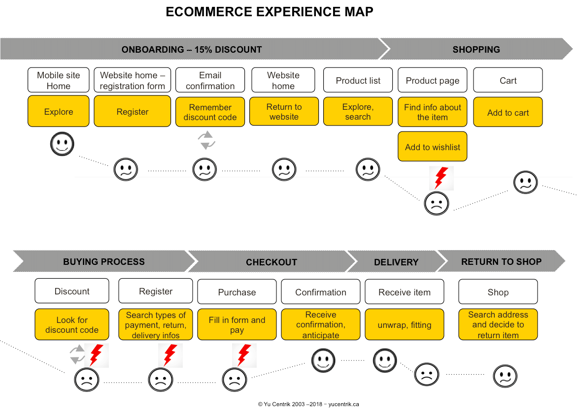
The experience map represented here is a true omnichannel experience: An online purchase that starts on the mobile site, then on the web site of a well-known Canadian brand that sells its products online and in-store. The objective here is to demonstrate that the site presents opportunities for improvement that would significantly reduce the drop-offs and increase the conversion rate.

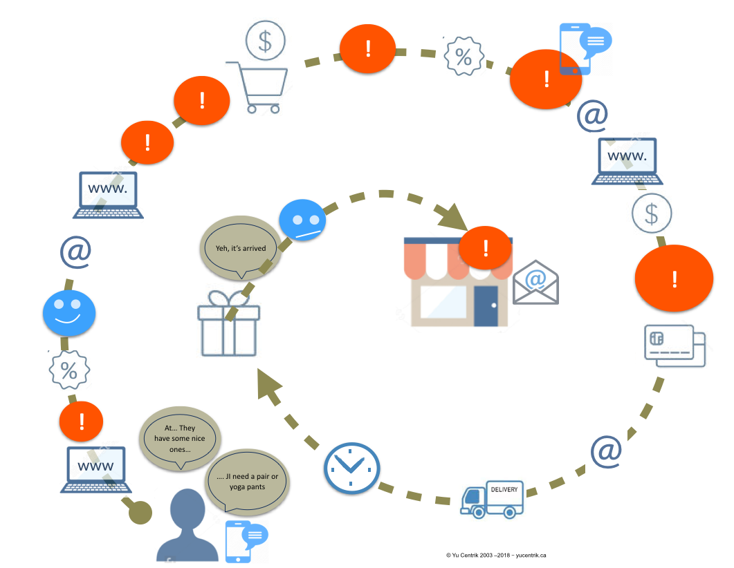
Two representations of an online purchase are shown here, one describing the tasks and the other visually expressing the pains and the gains. It starts with a need, a desire to buy some yoga pants. A quick glance at the mobile phone reveals that buying this type of product requires a slightly larger screen. Continuing on the website of the same company where a large pop-up invites the customer to get 15% off immediately upon registration. It’s enticing, why not!

The registration is fast, 2-3 pieces of info, enter the email address and hop, here’s the discount, that’s the user’s anticipation. Not so easy, as described on the map, it is from this moment that things get complicated: a validation of the email address is necessary before you can use the discount. Obviously this causes an interruption in the shopping task that could prove fatal to the merchant: leave the website to read the mail entity and confirm the email address. And it gets worse if we do not take note nor remember the discount code sent by email, as you’ll need to come back again to mailbox, as is the case in this experience.

Journey map

The more we try to move forward searching, selecting and adding the product to the cart, and the more things get complicated. Information about the size, color, material, and product view are difficult. Information about the type of payment accepted and the conditions of returning the items are missing at the very moment when one should be reassuring the future customer and be pampering him or her. The purchase form does not allow you to see the selected item at any time and the steps are not predictable. This is an accordion principle where when you go to the next step, the previous step disappears which is not a best practice. Many would have abandoned the process, but our goal was to go to the end of the process, so we hung on until the confirmation of the purchase. Phew, the confirmation arrives quickly by email, as well as the expected time of delivery.

The product arrives quickly, only three days later but unfortunately the size is too big. We decide to return it in store. The team on the floor does not seem aware of the procedures for returning purchases that have been bought on the Web. We are told however that this type of leggings should be purchased a smaller size, so why not mention it on the site from the start? Several phone calls later, we get a refund and leave a little disappointed the smaller size is not available in stores.

We encountered multiple problems on this site. They are linked to a lack of respect for user interface standards, usability standards, lack of knowledge about trust and online security issues, and many disruptions in the omnichannel ecommerce cycle (people in stores should be aware of what is happening online).

Consumers still face many barriers that prevent them from fully embracing a digital service channel. We are in the era of Service, and everything is Service. Consumers are becoming more demanding, their expectations are high and their loyalty is low. Even adopting a loyalty program will not prevent them from swapping brand, supplier or service.

Companies must adapt quickly and take the means to engage and retain their customers! When organizations are asked how important user experience is for them, all of them say user experience or UX (User Experience) is their # 1 strategy. In reality, they are still far from having operationalized their desire to offer optimal experiences. It results in a shortfall and dissatisfied customers, consumers or users. The experience map activity builds internal knowledge, brings consensus within the organization, and helps create fluid and consistent customer experiences.

The three levels of UX certifications we offer encompass all facets of what user experience really is and its true value. There is a range of activities and tools that can be integrated into the development cycle before design, during and after use, to ensure delivery of a product and service that is easy to use, that meet required needs and which engage customers.

These courses are designed for IT and digital managers including product owners, account managers, product managers, project managers, marketing managers and more. It’s for those who want to better understand UX and/or how to integrate UX activities into their projects. No prerequisite is needed for UX-PM1 certification apart from a curiosity for the subject.

See the dates of our next courses in French and English on Technologia website: Ottawa (English), UX-PM1  April 11-12, 2018, UX-PM2 May 10-11, UX-PM3 May 16-17, 2018.

* Adapt this customer experience map to your context, you can be called user experience map, consumer experience map, patient journey map, etc.

from Yu Blog http://ift.tt/2HOlom2
via IFTTT
Machines for Living In: Le Cobusier’s Pivotal “Five Points of Architecture” [ARTICLE]

Le Corbusier was a painter, writer, architect and planner, but he was also an adept promoter of novel designs and theories. So when he debuted his Maison Dom-Ino concept home, it boasted a light and elegant form, but was also cleverly named — its title referenced the look and modularity of gaming “dominoes” (with dots extruded to form columns) as well as “domus,” the Latin word for house.

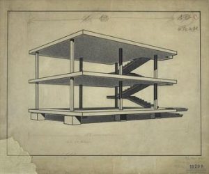
Maison Dom-Ino by Le Corbusier

In this project, Charles-Édouard Jeanneret, better known as Le Corbusier (or simply: Corbu), synthesized prefabrication, flexibility and minimalism. The design featured thin reinforced concrete floors supported by slim concrete columns. He described his solution as “a juxtaposable system of construction according to an infinite number of combinations of plans” to allow for “the construction of the dividing walls at any point on the facade or the interior.” At a time when load-bearing walls and masonry construction were the norm, this was an unusual approach to structural engineering. It would go on to inform much of his life’s work.

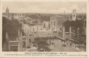
Corbu also had radical ideas when it came to architectural ornamentation, rejecting decorative traditions as outdated in the Machine Age. Critiquing the 1925 Exposition of Decorative Arts in Paris, he wrote: “The religion of beautiful materials is in its final death agony…. The almost hysterical onrush in recent years toward this quasi-orgy of decor is only the last spasm of a death already predictable.” He believed the the modern world had evolved beyond the need for decorative frills — useful, well-designed things would fill the void, not just in architecture, but for furniture, furnishings and fixtures, too.

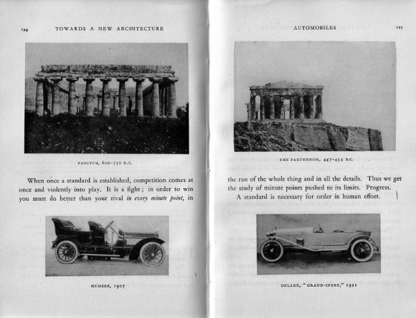
Corbu’s views were shaped by other schools of thought (like the Bauhaus) and other Modernists, including Adolf Loos, who wrote in Ornament and Crime: “The evolution of culture marches with the elimination of ornament from useful objects.” Many prominent architects would go on to reject ornamentation, eschewing traditional styles for sleek minimalist looks, in part thanks to the writings of Loos and Corbu. In the 1920s, Corbu published his own influential book, Toward an Architecture, in which he famously wrote “Une maison est une machine-à-habiter” (“A house is a machine for living in”). It reflected his functionalist vision for the future of domestic design.

Le Corbusier compares ancient ruins with sleek modern machines

The volume also contained a critical manifesto, Five Points of Architecture. These points expanded further upon ideas he explored in the Maison Dom-Ino, laying out a blueprint for contemporary domiciles free from structural conventions and historical precedents. The five points are interrelated, and can be summarized as follows:

  • Pilotis” (columns) used to lift up buildings and create open spaces
  • Free-form interior designs, enabled by structural columns
  • Free-form facade designs, liberated from load-bearing functions
  • Horizontal windows to provide even daylight across rooms
  • Rooftop gardens on flat roofs to protect concrete and create space

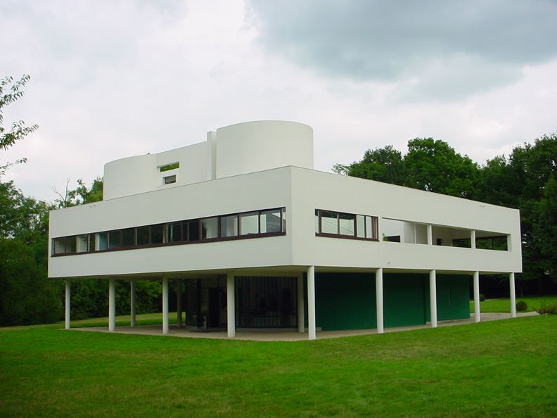
Corbu also practiced what he preached. By the late 1920s he had begun work on what is now one of his most well-known projects: the Villa Savoye. It was the physical embodiment of his five points, and this video does an excellent job of showing precisely how:

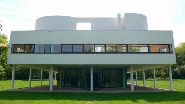
Corbu lifted up and supported the structure using concrete pilotis. In turn, interior columns freed him to create open floor plans and non-structural facades with long and narrow window strips (which would have been impossible if the exterior walls were load-bearing). On top of the home sat a roof garden, conceptually: a slice of the landscape lifted up, offsetting the footprint of the house with lofted green space.

The Villa Savoye by Le Corbusier, image by Valueyou (CC BY-SA 3.0)

For Corbu, the interplay of masses and light made the residence beautiful — its aesthetic was a product of function and geometry. “The plan is pure,” he boasted, “exactly made for the needs of the house …. It is poetry and lyricism, supported by technique.”

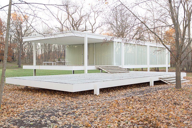
Farnsworth House by Mies van der Rohe, image by Victor Grigas (CC BY-SA 3.0)

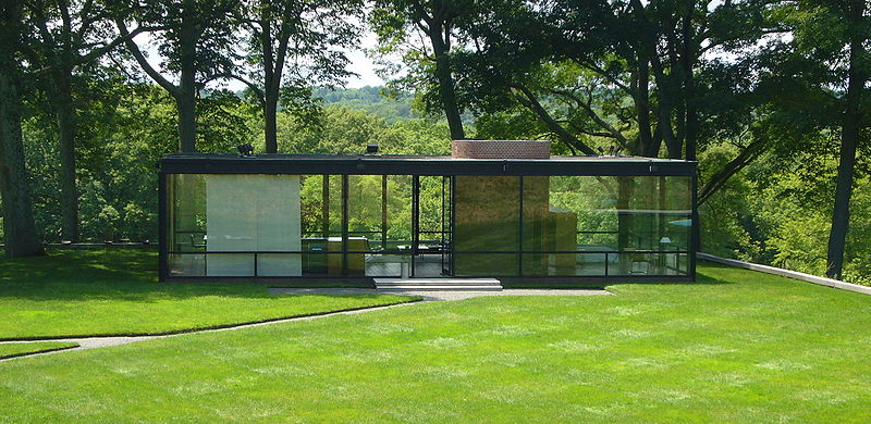
From the Villa Savoye, the lineage of Corbu’s design can be traced both backward (to the Maison Dom-Ino) and forward to other now-famous works of Modernist residential architecture, including the Farnsworth House by Mies van der Rohe and the Glass House by Phillip Johnson.

Glass House by Philip Johnson, image by Staib (CC BY-SA 3.0)

But Corbu’s five points and Villa Savoye did more than just shape residential architecture — they also informed decades of urban design, and, eventually, a series of vertical urban villages in the sky.

Coming up on 99pi: Functionalist plans for the future — new cities and vertical villages as “machines for living in”

from 99% Invisible http://ift.tt/2HvQAHI
via IFTTT

Ville Radieuse: Le Corbusier’s Functionalist Plan for a Utopian “Radiant City” [ARTICLE]

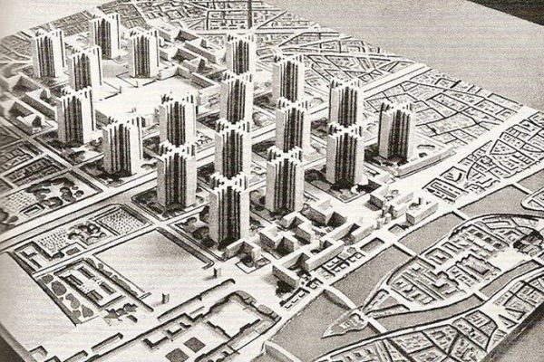
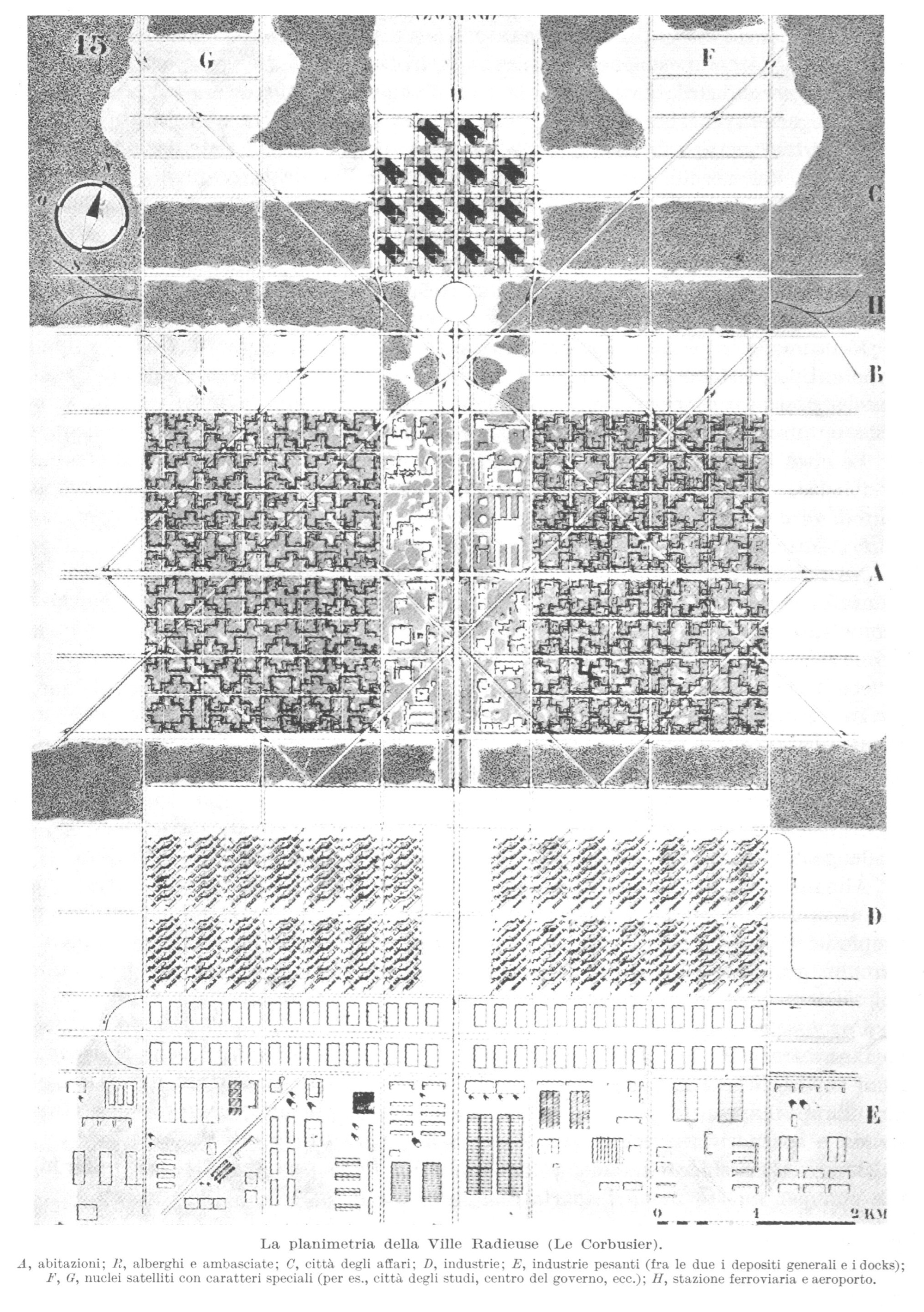
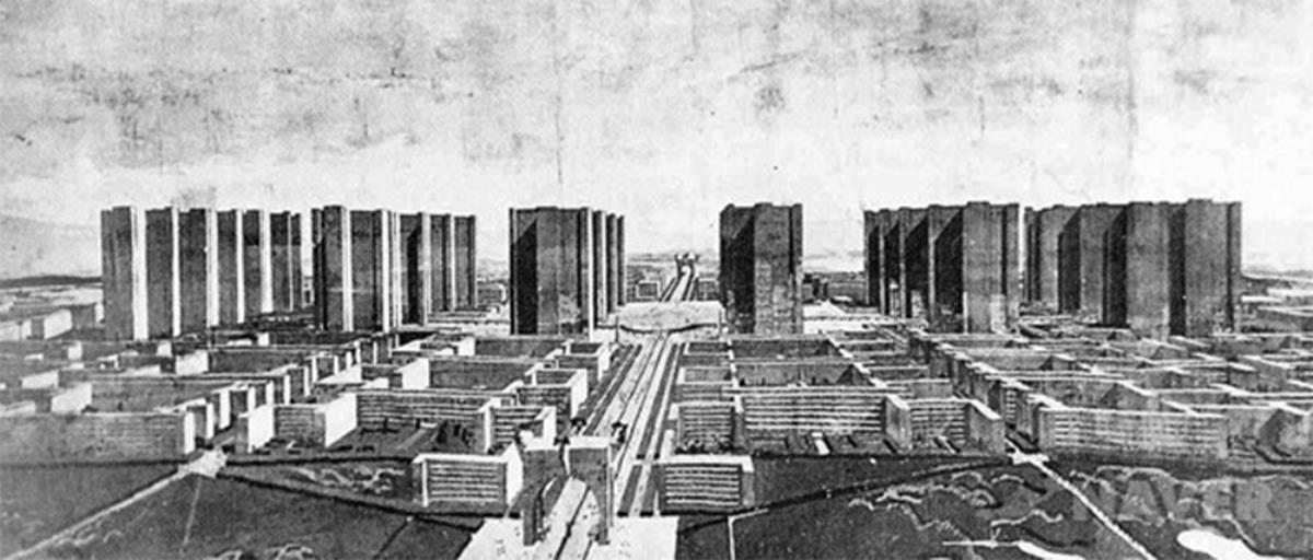
Designed in the 1920s by Le Corbusier, one of Modernism’s most influential architects, the “Radiant City” was to be a linear and ordered metropolis of the future. It was ambitious, a blueprint not only for a more rational urban environment but also for radical social reform.

The layout of Corbu’s ideal city was abstractly inspired by the arrangement and functions of the human body. Like a living organism, it consisted of organized parts that would work together as a whole.

Corbu’s approach to his visionary Ville Radieuse was an extension of other conceptual cities he had been working on, including the Ville Contemporaine and Plan Voisin. Notably, the latter of these sparked controversy after Corbu suggested razing historical parts of Paris to build it — he had a way of riling people up, arguably an intentional tactic to draw public attention to and elicit media coverage of his ideas.

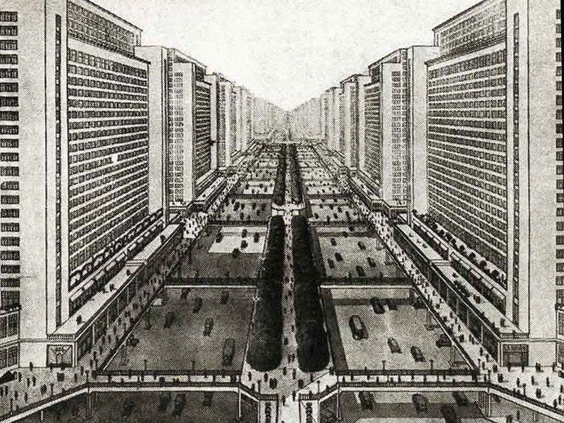
The basic strategy behind these various schemes was to create vertical architecture and leave plenty of shared open space in between for people to use and enjoy. The resulting horizontal areas would serve as traffic corridors as well as public landscapes with lush greenery. Pedestrians, cyclists, drivers and public transportation users were given dedicated routes to get around, set up (or down) at various elevations.

Everything in the Ville Radieuse would be symmetrical and standardized. At the center, a business district would be connected to separate residential and commercial zones via underground transit. Prefabricated housing towers would serve as vertical villages with their own laundromats as well as rooftop kindergartens and playgrounds. Apartments would have views out onto shared public spaces. Residents would enjoy peace and quiet, separated from industrial districts.

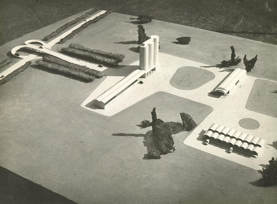
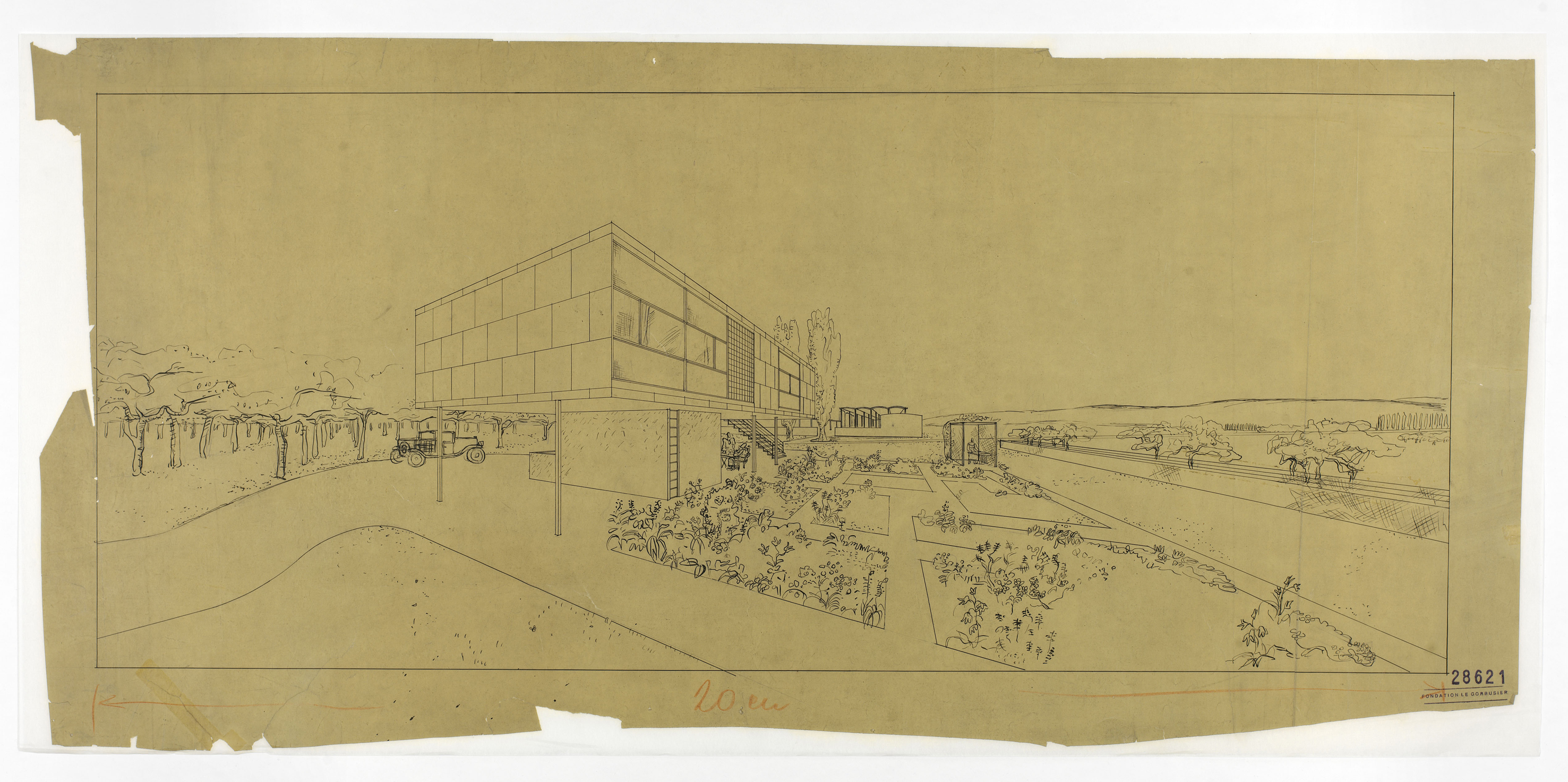
Corbu exhibited his master plan in 1930 at the third CIAM meeting in Brussels. He also developed parallel proposals for a Ferme Radieuse (Radiant Farm) and Village Radieuse (Radiant Village).

In theory, at least, he had design solutions for every kind of built environment, from individual houses up to entire cities as well as suburbs and agricultural communities.

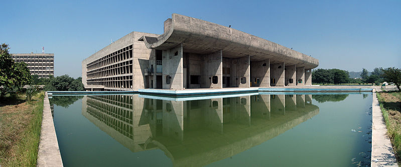
Though highly influential (in both Corbu’s own work and the work of other city planners), the Ville Radieuse was never constructed. Its ideas did, however, shape Corbu’s approach to urban design and architecture, from European projects all the way to Chandigarh.

Palace of Assembly building in Chandigarh, India, image by duncid, (CC BY-SA 2.0)

Le Corbusier created the general layout of this new Indian city, separating it into different functional sectors (or “urban villages”). He also worked on key structures, including the High Court, the Palace of Assembly, the Secretariat and a series of Open Hand sculptures. In the end, he wasn’t entirely pleased with the outcome, in part because he had to work with others who had competing visions. Still, Chandigarh arguably represents his most complete urban achievement.

“Open hand” sculpture, image by Raakesh Blokhra (CC BY-SA 2.0)

It is easy to look back on Corbu’s visions of concrete towers and overly large open spaces as being harsh and inhumane. But, for a time, he and Modernists thought they were building a better, more organized and functional world, crafting new cities as machines for living in.

And while his Radiant City was never realized as such, it did inform a number of projects, from Amsterdam’s massive Bijlmer to a series of structures Corbu designed to be urban villages in the sky.

Next on 99pi: cities in the sky — Corbu puts his plans in practice, constructing vertical “units of habitation”

from 99% Invisible http://ift.tt/2HFeSPk
via IFTTT
Unité d’Habitation: Le Corbusier’s Proto-Brutalist Urban Sky Villages [ARTICLE]

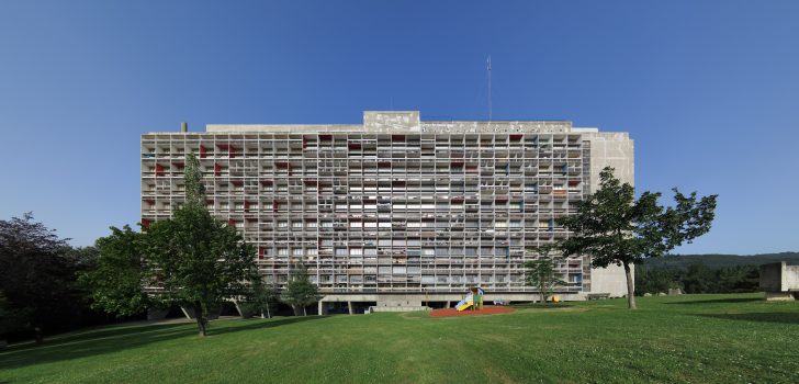
In the wake of World War II, architect Le Corbusier finally got an opportunity to put some of his lofty urban design visions into practice. Drawing on ideas he had been developing for decades, he created a series of structures that helped usher in an era of Brutalism.

A later Unité iteration in another part of France, image by Ken OHYAMA (CC BY-SA 2.0)

Despite its functionalist name, his first “Unité d’habitation de grandeur conforme” (or: “housing unit of standard size”) was designed to start an inspiring new chapter in urban planning. “Any architect who does not find this building beautiful had better lay down his pencil,” said Walter Gropius of the Bauhaus at its opening ceremony in Marseille.

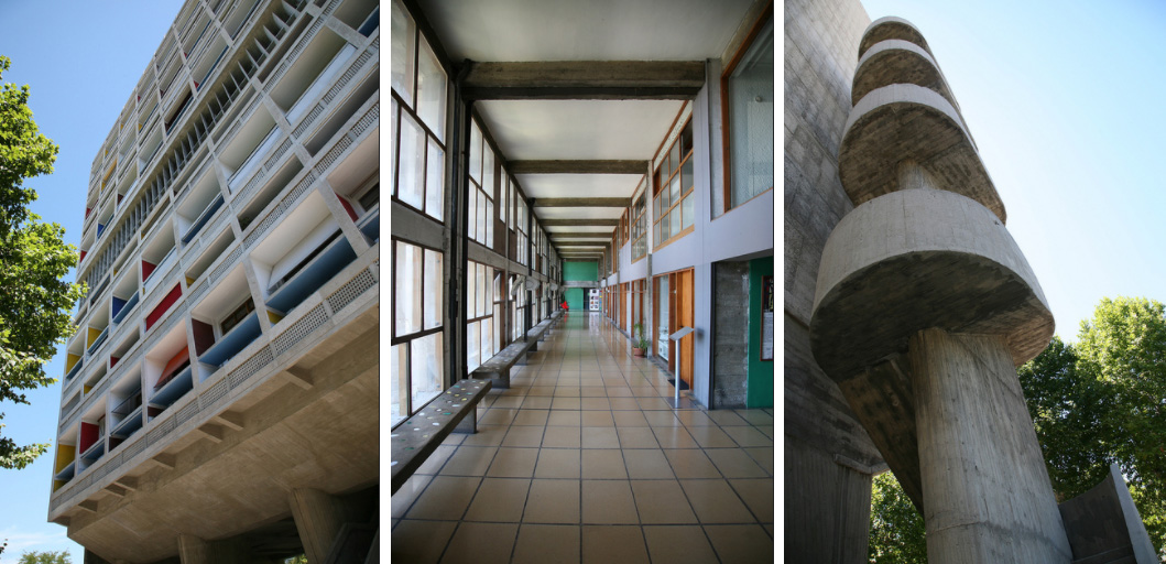
Exterior and interior images of Unité in Marseille by vincent desjardins (CC BY 2.0)

Constructed in the late 1940s and early 50s, aspects of the building’s structure reflected Corbu’s Five Points of Architecture — a set of strategies he had previously applied to smaller domestic projects.

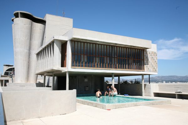
The roof of the Cité Radieuse, image by vincent desjardins (CC BY 2.0)

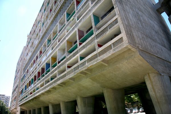
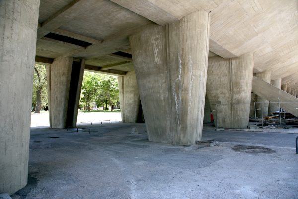
The new Cité Radieuse was lifted off the ground on columns and built as a modular framework into which units were inserted. A school and pool for children were set on the roof, along with sculptural ventilation towers reminiscent of ocean liner smokestacks (a nod to the modern Machine Age). Apart from that, some wood patterns ingrained in the board-formed concrete and color, ornamentation is relatively absent.

The base of the Cité Radieuse, image by vincent desjardins (CC BY 2.0)

In terms of its program, the building was organized to be a sort of self-contained city. It featured commercial and institutional functions between and above housing levels to serve the residential community.

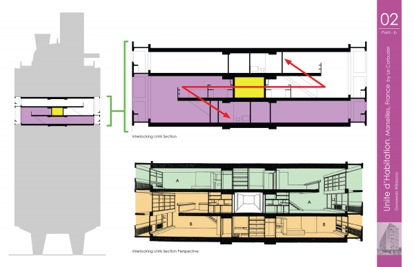
Building section shows interlocking housing units wrapping around a central shared corridor

Residences were stacked and wrapped around shared corridors, allowing each unit to extend from one side of the building to the other for maximum sunlight. This also minimized wasted hallway space, since only one access passage was required for each set of three living levels.

View of an interior “street” level by Michel-georges bernard (CC BY-SA 1.0)

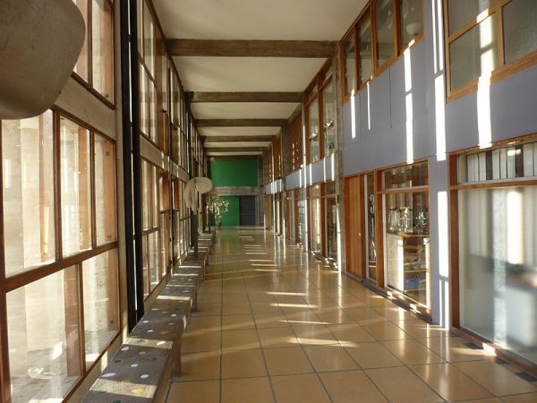
Every fourth floor, taller and wider hallways housed shops, restaurants, schools and recreational facilities for the structure’s 1600 residents. Many buildings are driven by floor-to-floor plans, but this strategy is fundamentally sectional — it is about verticals, not just horizontals.

Full-size model of a salon and terrace of the Unite d’Habitation, by SiefkinDR (CC BY-SA 4.0)

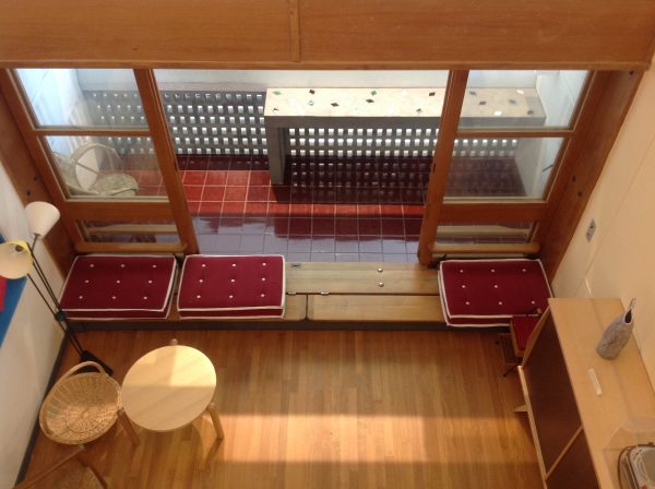
While not as free to form space as he might have been in a conventional house, Corbu carried his modular ideals into individual units as best he could. He offered residents 23 different layouts and an array of custom Modernist furniture, furnishings and fixtures — people could also pick out their own color schemes. In theory, over time, other similar adjacent structures could be built and connected by skyways.

Le Corbusier’s Berlin Unité by A.Savin (FLA)

For Corbu, the project was a turning point — it opened the door to more large-scale opportunities around the world, including a series of additional Unité structures that would come to be built around Europe.

He dubbed this first one Cité Radieuse after his earlier (unrealized) vision of a Radiant City. Locals in Marseille, however, sometimes refer to it as “La Maison du Fada” (meaning: The Nutter’s House).

For better or worse, these vertical micro-cities became an inspiration for architects and planners around the world in the decades that followed, including Brutalist designers. Indeed, that subsequent movement got its name from the French word for “raw” — Corbu described his choice of material as béton brut, meaning raw concrete.

from 99% Invisible http://ift.tt/2CnG6dM
via IFTTT
The Designathon Experience

People often talk about Hackathons. But what about Designathons? What’s it like to participate in one of those?

In October, I took part in one and even though we were absolute noobs, it really was one of the most incredible days of my life.

And here’s how it unfolded:

2 Days before: A friend I made at a previous hackathon, Sukanya Basu contacts me about this hackathon taking place in a couple of days. And I was so excited. Buuutt the last date to register had already passed. They hadn’t taken down the form yet, so we just filled it up anyway.

It was organised by Thought Factory and powered by Axis Bank. Very interesting!

We were asked to form teams of 3, so I quickly called a classmate of mine, Kavya Rai got her on board and we hit submit.

1 Day before: We got accepted! So pumped about this!

The day:

6:00 A.M: Wake up, take a bus, the metro and an auto, hoping to make it there on time. How do people get up this early.

8:00 A.M: I arrive! I look around. The room was full of adults. (We‘re 19) And they all had solid work experience as designers. Kinda apprehensive now. But at least we’ve got free food!

10:00 A.M: The brief is out — redesign the Axis Bank application and website to better suit millennials.

So basically redesign it for people our age. Piece of cake! They said that there are 2 rounds.

Round one: review your work with your mentors at 7:00 P.M and submit your work by 8:00 A.M the next day.

Round two: if you’re selected, present it to the main panel. Results to be announced at 10:00 A.M

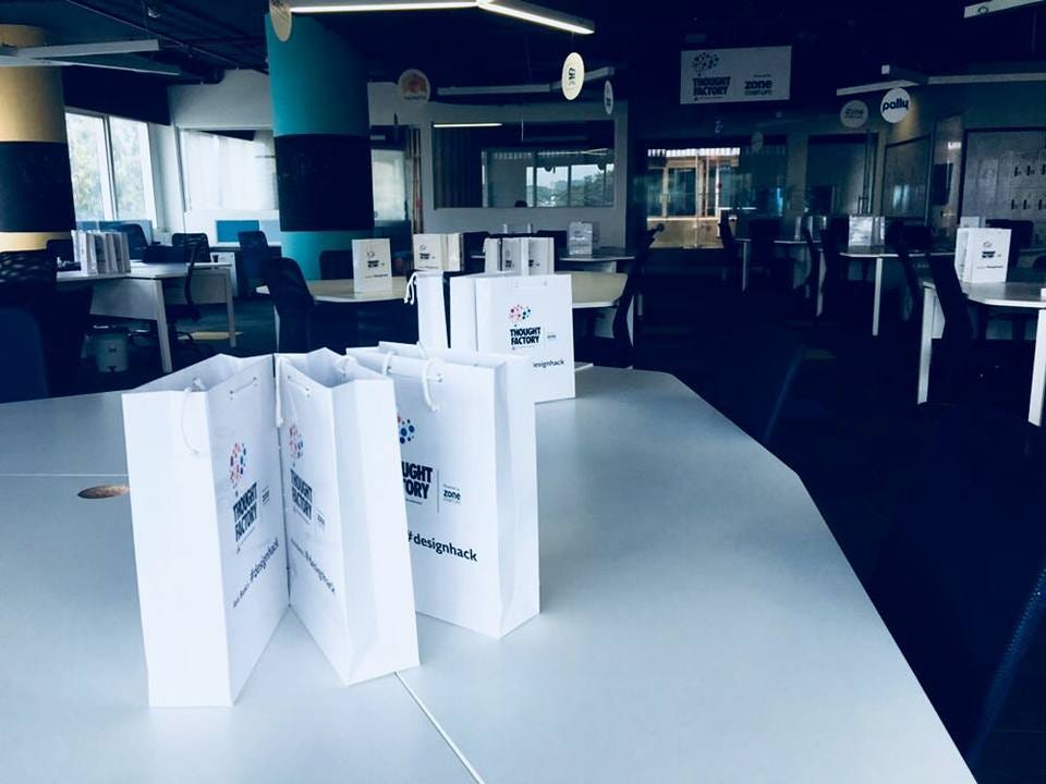
11:00 A.M: We begin. We walk up to our tables and see these goody bags just laying there waiting for us. There’s a book and a pen lying in there for each of us.

We grab our goodies and get to work.

Step one, look at the current app and compare it to its competitors. Here’s a shocker — they’re all the same. And they’re all hard to understand. This is gonna be a long day.

1:00 P.M: Grab some lunch and get right back to work.

4:00 P.M: We call up our parents. Because frankly, none of us have used banks long enough to know what NEFT, UPI or IMPS-MMD are.

7:00 P.M: We’re finally making some progress! We decided that adding features was redundant. Millennials won’t use the app if they don’t understand the basics. Plus we realised — through talks with our parents and internal discussions, that most people go to banks because its far easier to get some help when you’re around other people. If you get stuck on the app, odds are, not many people will be able to help you out.

8:00 P.M: Time for the mentor review. And one of the first things that came up was our age. Sigh. We briefly explained our idea to them. They said that we were on the right track, but it kinda felt like we were just barely skimming the surface of what they were expecting.

Back to work. It’s going to be a long night too then. Time for some RedBull.

Kavya heads back home but Sukanya and I decide to stay over and get some work done.

10:00 P.M: It’s getting cold and I’m getting restless. Luckily, the organisers come over to give us some free hoodies. They’re comfy!

11:00 P.M: So. Tired. Time for some coffee.

12:00 A.M: Can’t work anymore. Feel so saturated! So we take a break and explore! They’ve got a beautiful office out here. Damn.

1:00 A.M: Back to work. Sigh.

3:00 A.M: We’re done! Just a few finishing touches, but we can get that done in the morning. So we pack and try to get some rest.

3:30 A.M: I can’t seem to fall asleep. All the RedBull and coffee is back-firing. Ughh.

4:30 A.M: Finally fall asleep!

6:50 A.M: Back at it again. Kavya will be back in a couple of hours but we try to get some work done by then.

We slept on the floor. And this is literally what I woke up to. That and a back pain 🙂
src. Here’s what our web app looked like.

8:00 A.M: Hit submit. We aren’t too hopeful though.

9:00 A.M: The first round of results are out. We nonchalantly look through it. After the review with the judges, we’re sure we won’t make it.

But wait. Is that us? Right at the bottom of the list? We made it? But how! OMG WHAT!

I can feel my heart beat faster. This is surreal!

11:00 A.M: I restlessly tap my legs. I can’t stop moving. This is nerve racking! It’s our turn to present our idea.

We get up there, and nervously look at the judges, they smile warmly at us. That feels better. What’s the worst that can happen right?

We quickly take turns to explain our concept and get through the presentation.

Next, we wait. For the final results. This time though, we know we won’t win. So we’re calm again.

We talk to a couple of the other participants and they seem cool! We met Jasmeet and his team. They said that they saw our presentation and asked if we’d like to intern with them. OMG YES.

12:00 A.M: Food. Good food. It’s pizza 🙂

1:00 P.M: They FINALLY announce the results. Jasmeet and his team come first. No suprise there. The team that shared a table with us came in second -or maybe third, I might remember that wrong. We don’t really know the other team. But they were great. We stand up to leave and take the bus, metro and auto home.

But wait. They’re not done yet. They call us on stage (read: front of the room), and declare that we’ve come in fourth. What. There wasn’t supposed to be a fourth place!

Turns out, we were the reason the results were delayed. They were in that room arguing about whether or not we deserved a special mention of sorts. Damn.

Looks like we’re getting an iPad!

3:00 P.M: Naturally, this calls for a celebration! But we’re broke. So KFC it is. One big ass bucket for the 3 of us. I swear it tasted like heaven!

4:00 P.M: We drag our caffeinated, sleep deprived and yet oddly excited selves through the auto, metro and bus all the way home. And sleep.

It was a good couple of a days.


The Designathon Experience was originally published in Muzli -Design Inspiration on Medium, where people are continuing the conversation by highlighting and responding to this story.

from Muzli -Design Inspiration – Medium http://ift.tt/2FBCkMS
via IFTTT
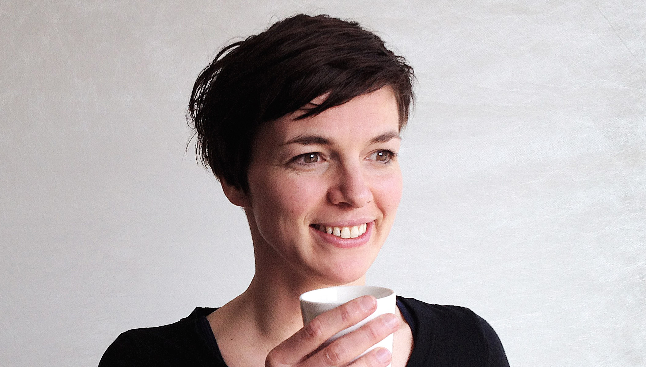
Nynke Tromp : le design vecteur de changements sociaux

Nynke Tromp travaille en tant que professeur adjoint en design social et changement du comportement (Behaviour Change) au département de design industriel de l’Université de Delft dans l’ouest des Pays-Bas. Après sa thèse et son travail en tant que designer au sein du studio Reframing, elle poursuit maintenant son travail de recherche sur le pouvoir caché du design afin de contrer les problèmes sociaux. Nynke est également membre de ‘Redesigning Politics‘, un groupe de réflexion créatif visant à redéfinir la pensée, les institutions, les structures et les interactions dans le domaine de la politique. Nynke s’intéresse à la façon dont les produits peuvent changer de comportement sans que les gens en soient conscients. Selon elle, cette influence implicite n’implique pas seulement une responsabilité sérieuse pour les designers, elle offre également un moyen puissant de soutenir le changement de comportement souhaité. Dans sa démarche de recherche, elle vise à développer les connaissances pour les designers afin de faciliter les comportements pro-sociaux. Ces connaissances permettent aux designers de contribuer à endiguer les problèmes sociaux urgents auxquels nous sommes confrontés aujourd’hui, comme l’obésité, l’épuisement des ressources ou les problèmes d’immigration. [ télécharger un de ses articles de recherche ]

Nynke Tromp works as an Assistant Professor Social Design & Behaviour Change at the department of Industrial Design, Delft University of Technology. After her PhD and working as a social designer in practice at Reframing Studio, she now continues her study to the hidden power of design to counteract social problems. Nynke is also a member of ‘Redesigning Politics’, a creative think tank aiming for redesigning thinking, institutes, structures and interaction in the field of politics. Nynke is intrigued by how products can change behaviour without people being aware of it. In her view, this implicit influence does not only imply a serious responsibility for designers, it also offers a powerful means to support desired behavioural change. In her research she aims to develop the knowledge for designers to design this influence in order to facilitate pro-social behavior. This knowledge allows designers to contribute in counteracting the pressing social problems we face today, like obesity, depletion of resources, or immigration issues. 

from Graphisme & interactivité http://ift.tt/2F02ED6
via IFTTT
Nynke Tromp : le design vecteur de changements sociaux

Nynke Tromp travaille en tant que professeur adjoint en design social et changement du comportement (Behaviour Change) au département de design industriel de l’Université de Delft dans l’ouest des Pays-Bas. Après sa thèse et son travail en tant que designer au sein du studio Reframing, elle poursuit maintenant son travail de recherche sur le pouvoir caché du design afin de contrer les problèmes sociaux. Nynke est également membre de ‘Redesigning Politics‘, un groupe de réflexion créatif visant à redéfinir la pensée, les institutions, les structures et les interactions dans le domaine de la politique. Nynke s’intéresse à la façon dont les produits peuvent changer de comportement sans que les gens en soient conscients. Selon elle, cette influence implicite n’implique pas seulement une responsabilité sérieuse pour les designers, elle offre également un moyen puissant de soutenir le changement de comportement souhaité. Dans sa démarche de recherche, elle vise à développer les connaissances pour les designers afin de faciliter les comportements pro-sociaux. Ces connaissances permettent aux designers de contribuer à endiguer les problèmes sociaux urgents auxquels nous sommes confrontés aujourd’hui, comme l’obésité, l’épuisement des ressources ou les problèmes d’immigration. [ télécharger un de ses articles de recherche ]

Nynke Tromp works as an Assistant Professor Social Design & Behaviour Change at the department of Industrial Design, Delft University of Technology. After her PhD and working as a social designer in practice at Reframing Studio, she now continues her study to the hidden power of design to counteract social problems. Nynke is also a member of ‘Redesigning Politics’, a creative think tank aiming for redesigning thinking, institutes, structures and interaction in the field of politics. Nynke is intrigued by how products can change behaviour without people being aware of it. In her view, this implicit influence does not only imply a serious responsibility for designers, it also offers a powerful means to support desired behavioural change. In her research she aims to develop the knowledge for designers to design this influence in order to facilitate pro-social behavior. This knowledge allows designers to contribute in counteracting the pressing social problems we face today, like obesity, depletion of resources, or immigration issues. 

from Graphisme & interactivité http://ift.tt/2F02ED6
via IFTTT